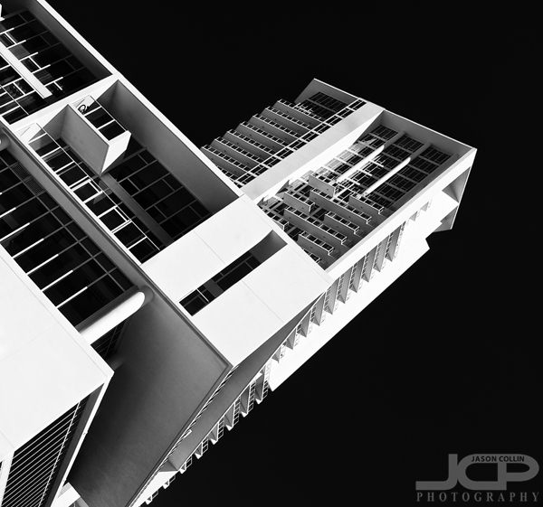
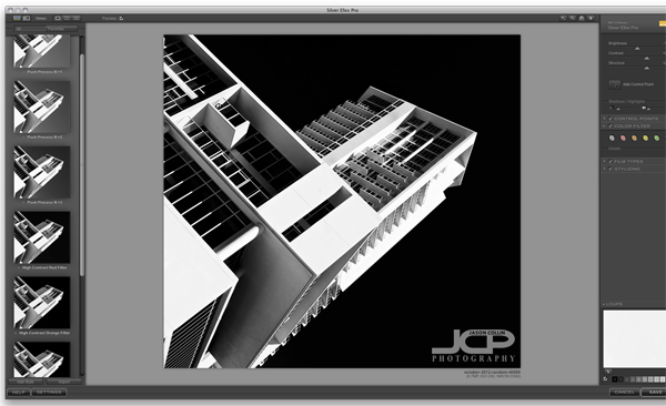
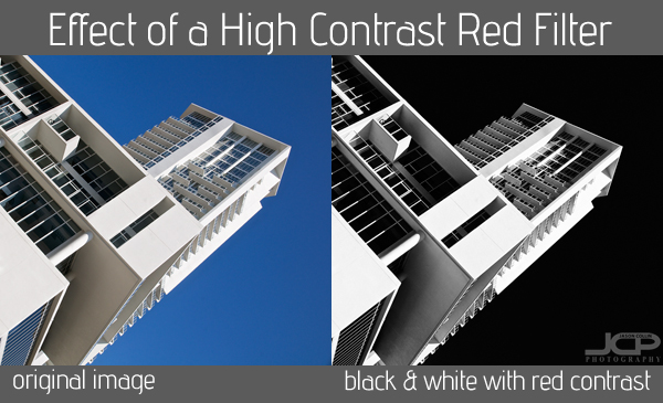
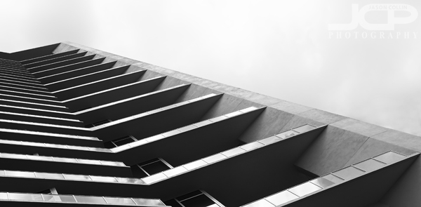
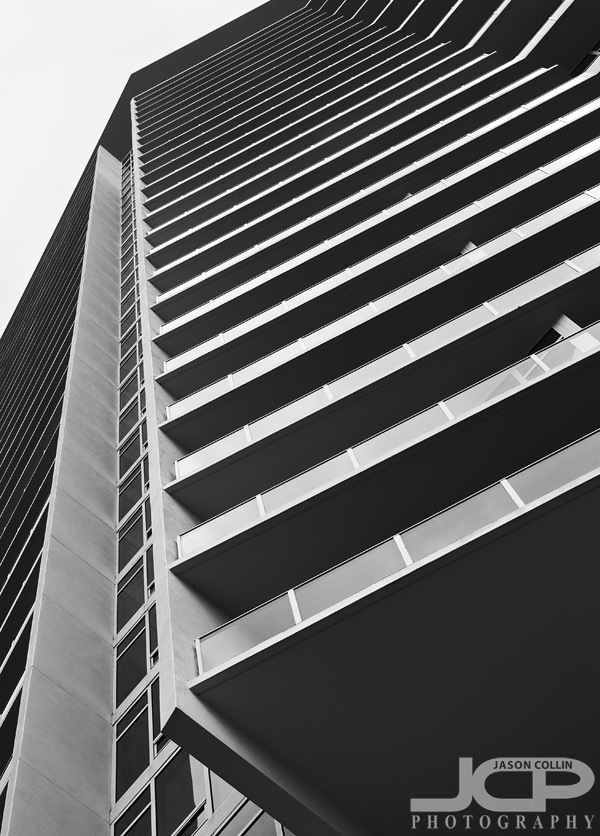
 Sykes Building downtown Tampa Florida black & white - Nikon D300 Tamron 17-50mm @ f/11 ISO 200 7-exposure HDR on tripod with cable releaseAfter shoots for specific client requests I often find I can create a subsequent set of images from the remaining shots. Such is the case with these black & white photographs featuring downtown Tampa and surrounding areas and landmarks. The client wanted landscape orientated shots for a use in an existing website template. Still, while out making those images I did rotate my DSLR to produce a few portrait orientated ones just in case the client might have a need for them and also just because I thought they would make cool shots and did not want to leave any unmade photographs that I saw the potential for.
 Tampa Theater marquee in black & white - Nikon D300 Tamron 17-50mm f/11 ISO 200 1/25th single exposure tripod mounted with cable releaseThe client actually chose the above image of Tampa Theatre, which did not standout to me personally in my initial culling, but after editing and convesion to black & white I kind of liked it because of the below eye level composition. I closed my tripod's legs to use only about half of its full height shooting from just around my own waist level.
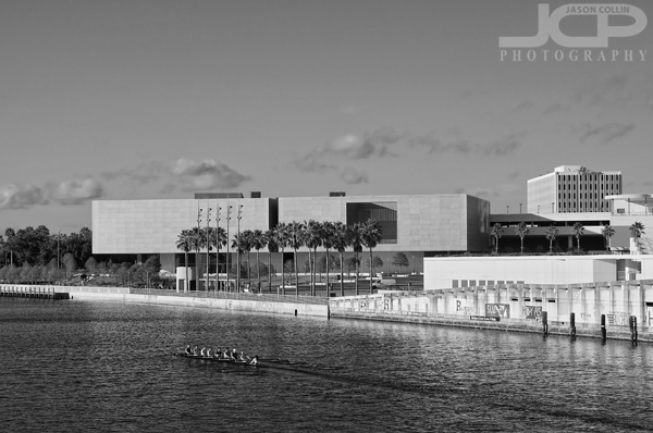
 The new Tampa Museum of Art with krew on Hillsborough River - Nikon D300 Tamron 17-50mm @ f/11 ISO 200 1/250th single exposure tripod mounted with cable releaseThe new Tampa Museum of Art building is very modern looking in person. However, I thought in the photograph above its rectangular architecture made it look more like buildings from the 1950s, especially in black & white. I saw the crew rowing team and waited for them to come into the shot to make the composition I wanted.
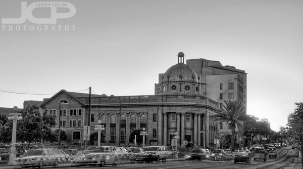
 Tampa First Baptist Church with traffic in black & white - Nikon D300 Tamron 17-50mm @ f/11 ISO 200 7-exposure HDR tripod mounted with cable releaseI had no idea the above building was the Tampa First Baptist Church. I saw people coming and going from it while I was in the area over the course of the afternoon and thought it was a courthouse or some other type of government building. Even while editing it I never even noticed the largest FIRST BAPTIST CHURCH engraved on top of the columns. I had to look up which building it was in Google to surprisingly find out it was a church.
 Tampa Downtown Skyscraper Skyline View in black & white - Nikon D300 Tamron 17-50mm @ f/11 ISO 200 7-exposure HDR tripod mounted with cable releaseThis last photograph is of a much more familiar and oft-photographed subject matter, the downtown Tampa skyline featuring the unique skyscraper in the center, the cylindrical Sykes Building. The moon can be seen rising in the upper left of the image.
I encourage everyone to go through past shoots and see if you can find a whole different photo story than the intended purpose of the shoot from the remaining images. Be sure and post a link to it in the comments below.


