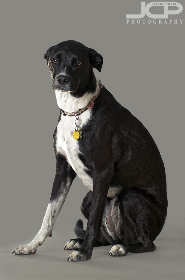
In an attempt to further refine my own skills with using the "Refine Edge" function in Photoshop's Quick Select tool I made the above photograph of Kiki right here in the living room. I knew beforehand I would be removing the background and painting in a new one. I have really started to like using this technique lately, especially when adding a pure white background. However, when including a full view of the subject, replacing the entire background be it with all white or any other color a lack of depth can result as the foreground and background are exactly the same. As you can see in the finished version on the right some shadow and light remain on the floor around Kiki's paws. After doing my usual edits to the image, the process I followed for making the digital backround was thus:
- Quick Select the floor area only & increase its contrast
- Using the Eye Dropper tool select a color from the increased contrast floor (gray-ish in this case)
- Increase the area Quick Selected to included everything except Kiki herself
- Using the Brush tool at 100% paint the background up until the edge of the floor
- Change the opacity to 40% and paint the floor area until a uniform gradient appears
In am happy with the process I used to make the digital background in this case, but I would like to improve the smoothness of the gradient/transition of the background to foreground even more by using every smaller opacities to brush it in.
 The finished final image of Kiki with gray background added in Photoshop leaving floor light and shadow for depthAlas there is no editing I can do to make Kiki not look like a sad puppy. This was right before our usual dog park time and I think she was wondering why do I have to sit through this when we could already be on our way to the park! Next time I will attempt her portrait in the morning.
