
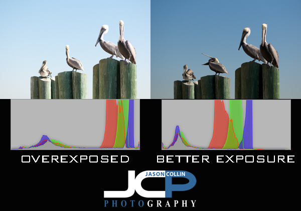
The histogram is a very useful way of checking and confirming exposure, especially out in the field. It may just look like a bunch of strange squigly lines or a series of jagged mountains, but the histogram tells you exactly what your photograph really looks like in terms of exposure and color. Since it is often hard to see the camera's review screen in direct sunlight to judge exposure, the histogram for a photographer is like a pilot flying an airplane by using only instruments. You do not even need to see the photograph to tell if it is a dark image, a bright one, or even a very colorful one. Essentially, the histogram looks like a rectangular box representing 256 shades of gray or individual colors, or all of them (see the histograms above showing grayscale and RGB color as Aperture 3 represents the histogram). Black is on the left edge and white is on the right edge. The more data to the left, means the darker an image is, and potentially underexposed. The more date to the right means a brighter image, and possibly an overexposed ones.
It is usually best to try and get as much of the data in the center forming a nice mountain, with no spikes at either the far left or far right edges. In the samples above, the left histogram has most of its data on the right side, indicating the photo is a bright exposure, as can be confirmed by looking at the photo itself. The histogram on the right is much more balanced and a more even exposure, as seen in the photo showing a bluer sky and better whites in the pelicans' heads.
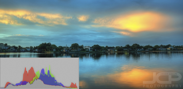
The above image of Smacks Bayou (as seen from just off my back patio) has a histogram that is about as ideal as it can get. The majority of the data for grayscale and RGB color is in the middle-center and there is a lot of range in those colors. The taller the peaks, the more of that particular color or shade of gray. There are also no spikes at either far edge of the histogram.